We Love Kimono Project 3
After choosing the obi design, Mamiya-san moved on to selecting the base color of my kimono. In order to keep harmony with the kimono and the obi, Mamiya-san suggested using the kimono’s base color as an accent in the obi also. I agreed.
Which color do I want?
Blue is my favorite color, and my last three cars were all in cobalt blue. So should be my summer kimono!
“OK, I will send you several sample fabrics via physical mail,” said Mamiya-san. Why physical mail? Why doesn’t he simply take a photo of the fabrics and send it to me electronically? I asked.
“Well, look at the photos of your kimono on the screen. The same kimono looks quite different from one photo to the other. It’s too risky to choose the color without seeing it on the real fabric,” said Mamiya-san.
By then the pandemic situation already started to affect the mail delivery schedule. We were nervous, but Mamiya-san mailed the sample to me anyway.
The color samples took exactly three weeks to reach me in Seattle, while in a normal situation it would take less than a week.
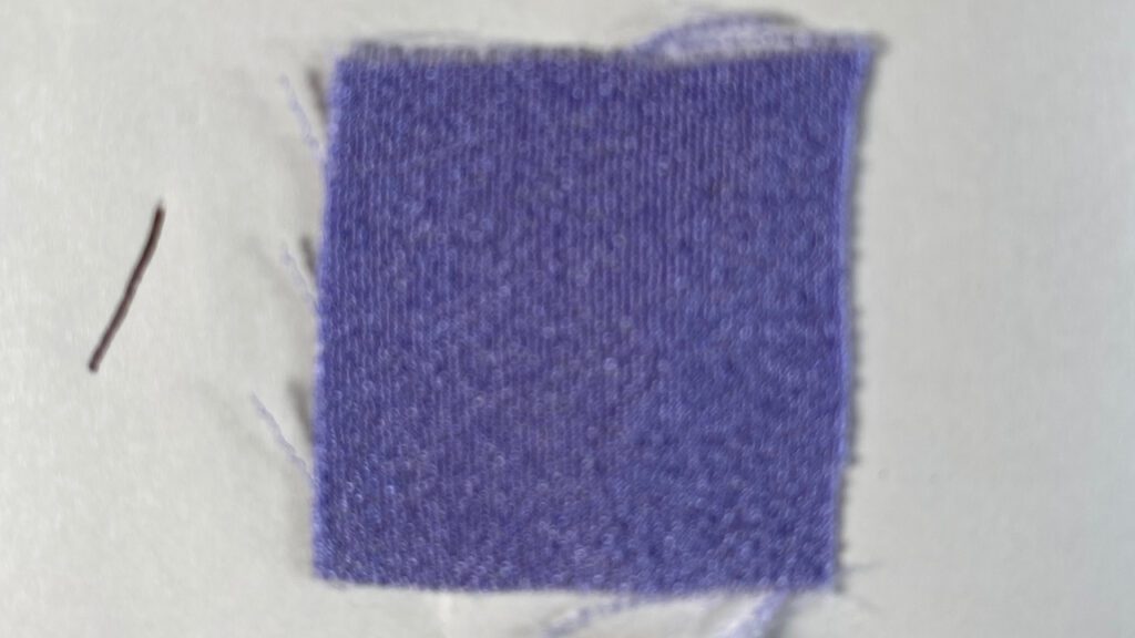
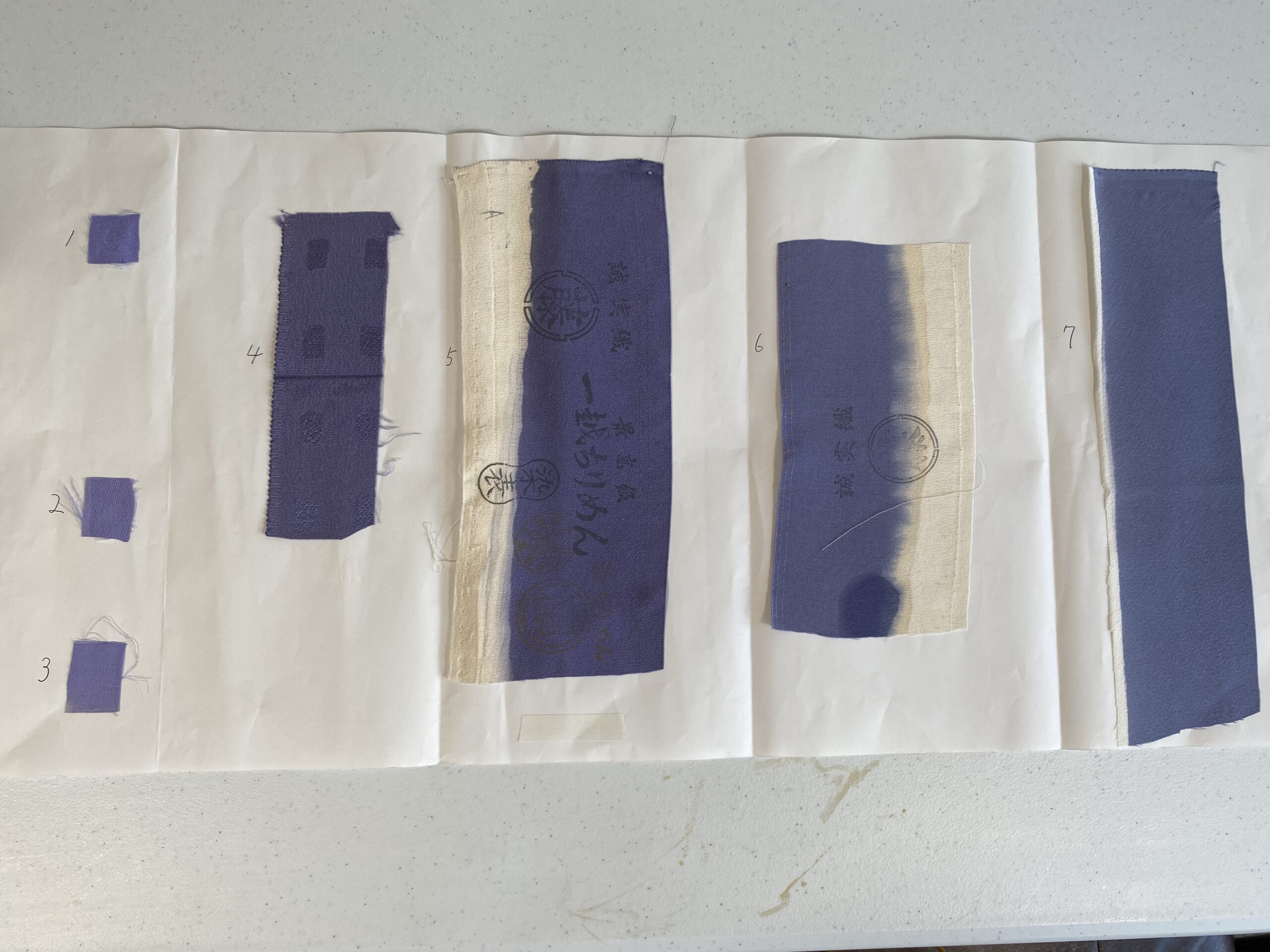
Seven pieces of cloth were glued on a sheet of white paper, with the numbers 1 through 7 written next to each piece. All the pieces looked like the leftovers from rolls of kimono fabric. Numbers 5, 6, and 7 looked to be the edge of the roll because part of them was left undyed.
These seven colors were quite different to the naked eye even though they were more or less the wisteria color. Numbers 1-3 were much brighter than 4 and 5. Numbers 6 and 7 were dull compared to #1-3. Number 1 was the most brilliant.
Once I received the sample fabrics, I chatted with Mamiya-san online. He asked about Seattle summers. How does the sky look compared to Japan’s summer sky?
“The blue is much clearer than the sky in Japan”, I replied.
Then let’s go with No. 1, he said.
“I wouldn’t recommend this color to a customer in Japan, but it would be suitable under the blue sky in Seattle,” he said.
I took a photo of the color sample with my iPhone, uploaded it on my computer, and looked at it on the screen. Where did the wide variety of shades and shines go? On my computer screen, most of them look the same! How could I possibly choose the right color?
Mamiya-san was right. I appreciated that he sent me the physical sample.

By the way, Mamiya-san mentioned that one of the colors is called “Fuji Nando藤納戸.” Fuji means wisteria, and Nando means storage room. The color that wisteria flowers would look like in a dim storage room… Such an intriguing expression to describe a color, isn’t it?
