With the Medashi of my Obi complete, Kosaka-san, the kimono maker using Tegaki Yuzen, a hand-dyeing method, started his work of making my kimono.
Tegaki Yuzen 手描き友禅 is a resist-dyeing technique that became fashionable at the end of the seventeenth century in Japan. Applying paste dye directly to fabric to prevent color transfer to other areas, Yuzen technique enables freehand designs with multiple colors.
Sketch the Design
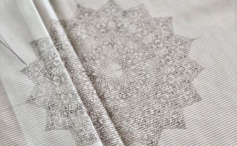
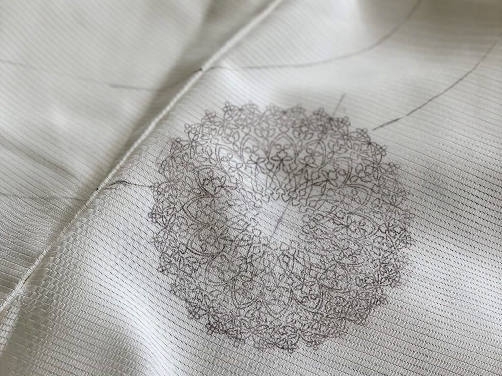
The first step is to sketch a design on the white fabric using aobana ink. Extracted from commelina communis, also known as Asiatic dayflower, aobana ink is soluble in water. The two photos above are Kosaka-san’s sketches on the kimono fabric.
Following the Islamic Flower design of Katsuyama-san’s medashi of my Obi, Kosaka-san adds his own interpretation to the Yuzen design.
It may not be obvious from the photos above, but did you notice that the white fabric is already sewn together?
Kimono fabric is long and narrow. It is cut into eight pieces and sewn together in the shape of a kimono. The design pattern of a Homongi runs through different pieces. In order to make sure that the design patterns align perfectly across the different fabric parts, the eight pieces are temporarily stitched together before sketching the design. After the sketch with aobana ink is done, the pieces are disassembled and stitched back together to the original long, narrow shape.
The sketch with aobana ink is complete. Kosaka-san disassembled and stitched back the kimono fabric into the long narrow shape.
Itome-oki 糸目置
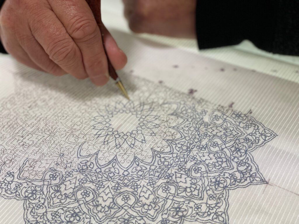
The next step is to directly place paste dye on the lines of the aobana ink sketch.
Similar to how a baker uses a pastry bag to decorate a cake, the craftsman squeezes the paste dye out of the nozzle. The very small nozzle makes it possible to dye very thin lines with precision. Unlike aobana ink, the paste dye is, literally, dye. It can’t be washed away once placed on the fabric. One fumble can mess up the whole thing.
It requires years of practice to squeeze out paste dye in a consistent way to dye such fine lines. This process is called 糸目置Itome-oki. Itome means “thread pattern,” depicting the very fine lines like a thread. This is the most distinctive feature of Yuzen technique.
In response to Dancing Elephants Press Prompt week 51/52
“What is your name?” “My name is Akemi.”
In Japanese, however, the question doesn’t end there. Always there is a second question: “How is your name written?”
The Japanese input method editor I use on my computer lists the following different combinations for a name “Akemi.”
明美, 昭美, 朱美, 暁美, 曙覧, 朱海, 明見, 曙美, 朱実, 明海, 曙海, 朱見…
The list is not exhausted, but is only of examples of how “Akemi” is commonly written.
That’s because there are many Kanji characters with different meanings that are pronounced the same way. Depending upon which Kanji character is used, the meaning of the name is different.
Let’s break down my name… It’s Ake + Mi. The first part has one Kanji character, and the second has another.
Ake 明 … This character means bright.
Mi 美… This character means beautiful.
Yes, my name literally means “bright and beautiful.”
Although my name was not that unusual, whenever I was asked to explain how my name is writen in Kanji characters. I always had to answer with sarcasm. Who would introduce oneself as “I’m bright and beautiful?”
Do I live up to my name? I don’t know. But at least I’m assured that my parents had some kind of expectation of me…
In early August 2020. Mamiya-san, my kimono retailer, received a “medashi 芽出し” from Katsuyama-san, the Obi maker. What is it? I had no clue.
Medashi is a trial sample that an obi maker weaves. Before making the complete obi, the maker weaves the main design pattern using the sample yarns. This way, any further requests or changes from the customer can be reflected in the course.
Mamiya-san tried to snail mail the medashi to me just like he did with the base color sample of the kimono fabric. (See We Love Kimono Project 3). However, due to the worsening pandemic, all the airmail from Japan to the US was suspended. Surface mail would take three or more months. We had no choice but to fall back on relying on digital photos this time.
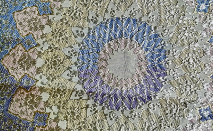
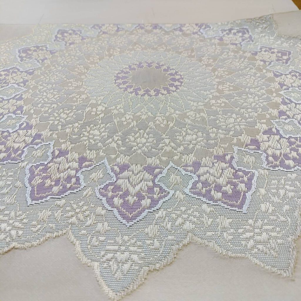
The photo above is a close-up of the medashi. I noticed some light pink and gold colors were included together with the wisteria blue that was used as the anchor color. Starting in the center of the Islamic Flower design, different patterns radiated one after another. The yarn of the raised part looked thicker than the recessed part, but can it be? I was mesmerized by its complexity.
The back side shows you how many different yarns are used for making this one design.
I thought it was beautiful. Shall we move on? No, was Mamiya-san’s feedback. According to Mamiya-san, Katsuyama-san was overusing the colors. Is the gold thread really necessary? What about pink?
Since Mamiya-san has worked with Katsuyama-san many times before, Mamiya-san didn’t hold back his candid opinion. Let’s make it simpler, he suggested. That way Katsuyama-san’s true graceful design will be more prominent. Mamiya-san convinced Katsuyama-san to make a second try.
I asked Mamiya-san if I could still keep the first medashi. Sorry, Akemi-san. This is Katsuyama-san’s important property. He is to keep it so that he can reference it for his future work. It is less likely he will make exactly the same one. But it’s important that Katsuyama-san keeps all the medashi as his portfolio.
Soon after Mamiya-san sent me a photo of the first medashi, he sent me this photo. What is this? Are these the colors that Mamiya-san chose for my obi? I was horrified.
Don’t worry, Akemi-san. They are not the final colors, Mamiya-san assured me. These colorings are a necessary part of the weaving process.
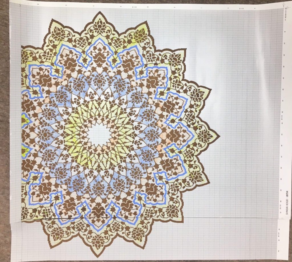
The Nishijin district in Kyoto implemented Jacquard looms from France in the late nineteenth century. Katsuyama-san’s weavers are trained in this technique. Katsuyama-san first draws and paints the obi design onto a paper grid. The photo above is of hand-painted grid design paper. Each column represents one warp yarn, and each row represents one weft yarn. In order to make sure that the weaver doesn’t get confused, the convention is to use distinct colors for each different color thread. The colors on this paper have nothing to do with the real colors.
This is the closeup of the grid paper.
Once drawing and painting on the grid paper is finished, Katsuyama-san scans it to a computer for two reasons. One is to create Jacquard punch cards; the other is to create another paper for weavers to use as a guiding source when s/he weaves this pattern.
This is the closeup of the Jacquard punch cards. Each card is narrow and long, indicating how each warp should be lifted so the weft can go through. Each card has eight rows, which are meant to control eight weft yarns. The cards are bound together with the white thread as shown.
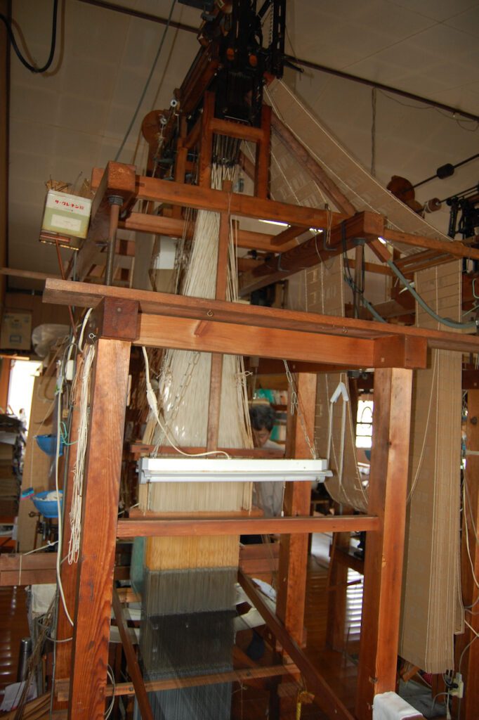
I remembered a photo I took when I visited Katstuyama-san’s studio. The long rail of punch cards was hanging from the top of the loom. I never knew then, but that’s how they control the warp. I asked Mamiya-san how many cards were punched and put together like this for my obi. He replied: 9200 cards!
This is the reference paper that the weaver uses. She has a table that indicates which color on the paper corresponds to which color of the real yarn.
When I visited Katsuyama-san’s studio, the weaver was working on the obi with the diamond design. The paper shown here must have been her reference paper.
I heard that the Jacquard punch cards are replaced with computers nowadays. Why still use the physical punch cards, I asked. Because if a mistake is made, it is easy to find it with the punch cards and correct it right away.
Why hand loom instead of using a machine? According to the book Nishijin Ori – Nihon no Senshoku 11 published by Tairyusha (p. 77), a machine can handle up to ten different colors. If the obi uses more colors, a hand loom is a must. Some obis use over fifty different colors!
The book was written in 1976. Machine looms must have advanced quite a bit since then. But Katsuyama-san still chooses handloom, because this way each obi looks slightly different and has its own beauty that can’t be replaced with any other.
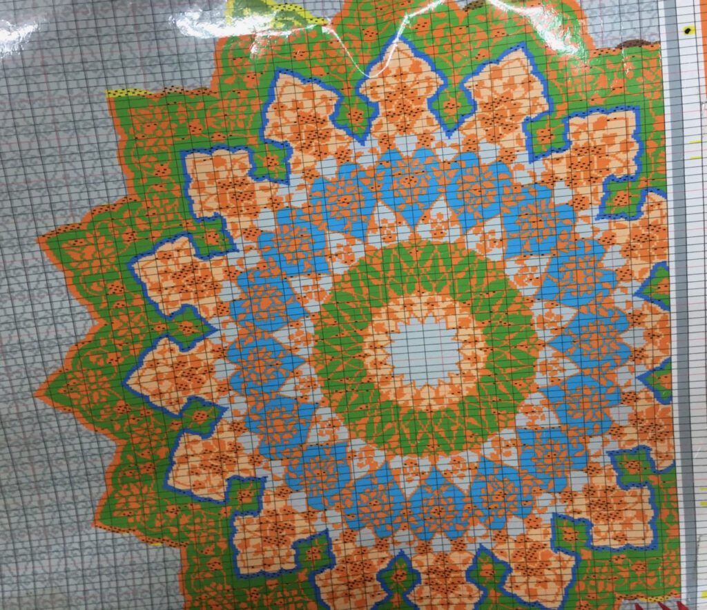
About four months after I received the first medashi photo, I got a photo of the second one.
The second medashi had no gold thread, no pink, but more subtle variations of blues and wisteria colors. The outer rim of the design is now a much lighter color. Mamiya-san said, let’s go with this one.
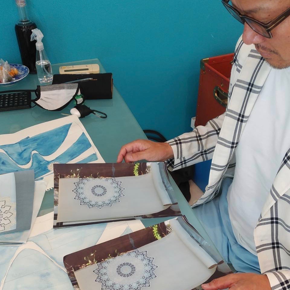
Mamiya-san will show this medashi to Kosaka-san so that Kosaka-san can determine the base color of the kimono. Kosaka-san will draw Yuzen design on the left shoulder and the bottom front of the kimono based on this medashi.
I asked Mamiya-san if Katsuyama-san always makes two medashis for an obi. Not normally. Since this project was an unusual collaboration, it was necessary to take an extra step. I appreciate the craftsman’s attention to detail. I bet Katsuyama-san pursues efficiency in his process. But sometimes efficiency gives way to the pursuit of perfection. I’m learning how a craftsman works.
Silk kimono is categorized into two groups based on how the fabric is made.
One type is called Sakizome先染or Ori 織. The yarns are dyed first, usually the warp and the weft yarns separately, then they are woven. The most famous Ori kimono is Oshima Tsumugi 大島紬. With the intricate patterns and painstaking process, Oshima Tsumugi is one of the most expensive kimono fabrics in Japan.
Another type is Some 染. The undyed yarns are woven first, hence making natural-white color kimono fabric first. The fabric is then dyed in different colors and patterns.
Some 染 kimono is always considered more formal than Ori 織 kimono. For formal tea gatherings, Ori kimono is too casual, no matter how expensive it may be.
Once he had sketched a rough design of my kimono, Mamiya-san, my kimono retailer, selected the dyeing method of the kimono fabric. His choice was Yuzen hand dyeing 手描き友禅, and approached Kosaka-san, a Kyoto-based Yuzen kimono producer.
According to Mamiya-san, Kosaka-san’s name came to his mind right away when we agreed to launch We Love Kimono project. While Kosaka-san has a long experience of working with traditional Yuzen craftsmen, he tries to incorporate contemporary elements in the design. Kosaka-san will be willing to take up this challenging project, Mamiya-san thought.
What is Yuzen hand dyeing? A short video below shows you its process.
With the rough sketch he drew and a photo of Katsuyama-san’s Islamic Flower obi, Mamiya-san met with Kosaka-san. Mamiya-san’s idea was to replicate the obi’s Islamic Flower design onto the kimono. How large, where, and how similar the design should be on the kimono, was left up to Kosaka-san.
Kosaka-san getting introduced to the obi and kimono design.
After meeting with Kosaka-san, Mamiya-san went on to meet with Katsuyama-san to further discuss the project.
Mamiya-san showed Katsuyama-san the rough design of the kimono as well as the base color. The obi’s basic design is already selected, but the color combination is limitless. Does Katsuyama-san want to use the same color on the kimono and the obi? Or does he want to choose a matching, but slightly different color? Or will he choose contrasting colors?
Mamiya-san told me that it is not easy to dye the obi thread exactly the same color as the kimono. With obi, they dye the thread first then weave. With Yuzen kimono, they place colors onto the white silk fabric that is already woven. Since the order of dyeing and weaving is different, the final look of the color varies even though they use the same pigment.
For this project, Katsuyama-san would weave the obi first using the base color as the anchor color. Once the obi is woven, Kosaka-san would dye the kimono fabric while closely looking at the completed obi.
After talking to both Kosaka-san and Katsuyama-san, Mamiya-san slightly altered the kimono design. I had no objection. I was just thankful that I had these experienced craftsmen taking the time and effort to make my kimono and obi.
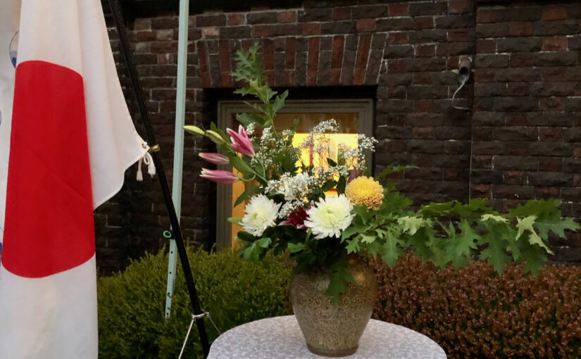
For a change, I didn’t have a problem choosing flowers. Chrysanthemum was the one I picked at the wholesaler.
The Japanese Consul General in Seattle is going back to Japan at the end of this month, and a farewell party was scheduled with a short notice. As the current president of Ikebana International Seattle Chapter, I was asked to create a couple of Ikebana arrangements. My pleasure!
Although no formal law exists, chrysanthemum is widely accepted as Japan’s national flower. On the front of the passport as well at the entrance of the Consul General’s official residence, the emblem of the chrysanthemum flower occupies the prominent space.
I chose white and yellow chrysanthemums, to be the main characters for my arrangements. For the arrangement placed next to the podium in the garden, as shown in the photo on the top, I added lily buds to add an accent color. The oak branches shaped the basic structure of the arrangement, horizontally spread.
Next to the gold screen inside the room, I used the long calla lily to accompany the yellow chrysanthemum, to match the shape of the vase.
Thank you, Consule General, for all the work in Seattle. Please have a safe trip, and wish you the best of luck in the new assignment!
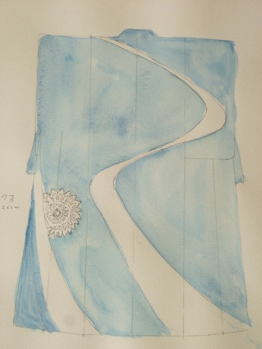
The base color of my kimono is selected. The next step is to decide on the kimono design. And an expert’s advice is crucial at this stage if you don’t want to screw up.
In Western culture, there is certain dress code depending on the occasions. As a mother, you don’t wear jeans for your child’s wedding reception, but choose a dress, maybe a long one.
With kimono, such a dress code exists also, only more complicated.
What determines the formality of a kimono? There are several factors.
Material
Among different types of material, silk is the most formal. Kimono made of cotton, linen, or wool, is considered casual and not to be worn on formal occasions.
Number and method of crests
Among silk kimono, the ones with crests, either five, three, or one, are more formal. The more crests, the more formal. Crests are either dyed or embroidered, and the dyed one is more formal than the embroidered one.
If the kimono has five or three crests, all the crests are dyed. If the kimono has only one crest, the crest can be either dyed or embroidered. The dyed one is more formal.
Design pattern
A silk kimono with five or three crests has an elaborate design only on the bottom.
A silk kimono with one or no crest can have design all over. If the design continues across the seam lines on the left shoulder and the bottom, it’s more formal. If the design is cut off on the seam lines, the kimono is less formal.
Tea gatherings are not as formal as weddings, but they are still considered pretty formal. Even for the summer kimono, the fabric should be silk, not cotton or linen. For my kimono, Mamiya-san suggested having one crest dyed on the back, with connected designs on the left shoulder and the bottom.
This type of kimono is called Homongi 訪問着.
Mamiya-san, my retailer, sent me a rough design he sketched. It reminded me that Mamiya-san majored in art in college.
In the US, the first Monday in September is Labor Day. Everybody enjoys the three-day weekend. My husband flew to New York City to spend time with his college friends.
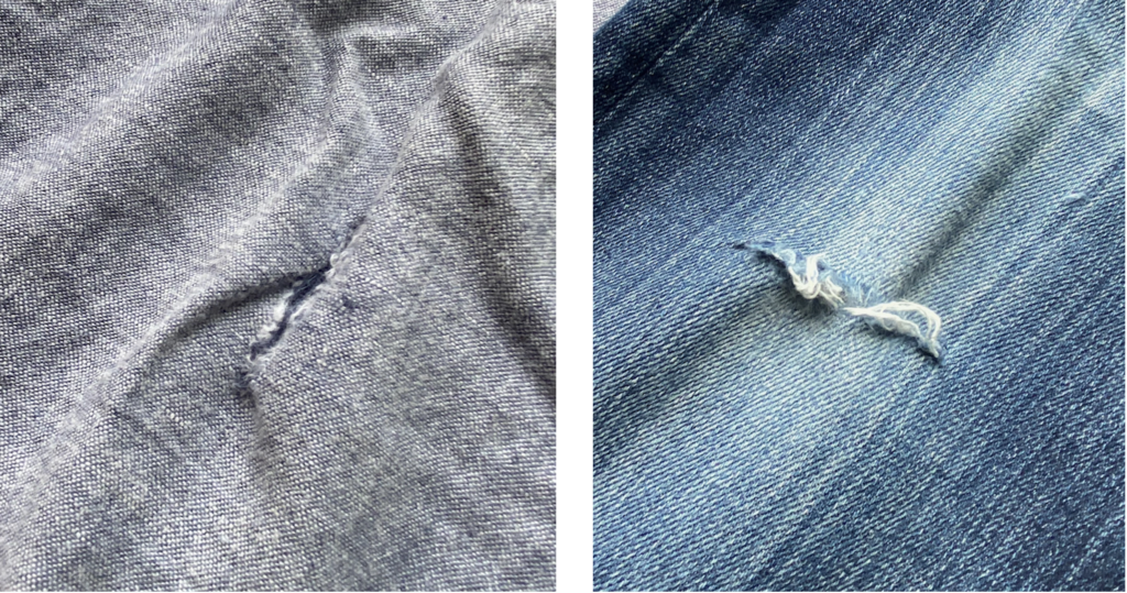
Alone at home, I picked two pairs of pants. Both of them had a tear on the left knee.
In the past weeks, I have gone shopping, searching for new pairs. I couldn’t find anything I liked. Nothing was the right style, the right color, or the right texture. Maybe I was hoping to find exactly the same kind as the torn pants, which were already out of fashion a long time ago.
Alone at home, I picked two pairs of pants. Both of them had a tear on the left knee.
I have no idea why only on the left knee, but the tear clearly indicated how much I liked to wear them.
Left alone at home on the Labor Day weekend, I picked up the torn pants, thread, and needle, and started stitching. Did I know how to do it? Not quite, but there were more than enough YouTube videos instructing where to start, what to do, and how to do it.
The only colors of the tread I had were black and white, so I chose black for my jeans and white for the other pair.
For several hours, I simply stitched. I zoomed in so close that I could see how each warp and weft were woven on top of each other. I even counted how many threads of weft I should skip before poking the needle for the next stitch.
The outcome may not look appealing, but I don’t care. With my labor of love, these pants have been resurrected. Instead of being trashed, both pants will continue to give me protection and comfort for several more years.
From now on, when everybody else celebrates Labor Day, I will celebrate my own Sustainability Day!
After choosing the obi design, Mamiya-san moved on to selecting the base color of my kimono. In order to keep harmony with the kimono and the obi, Mamiya-san suggested using the kimono’s base color as an accent in the obi also. I agreed.
Which color do I want?
Blue is my favorite color, and my last three cars were all in cobalt blue. So should be my summer kimono!
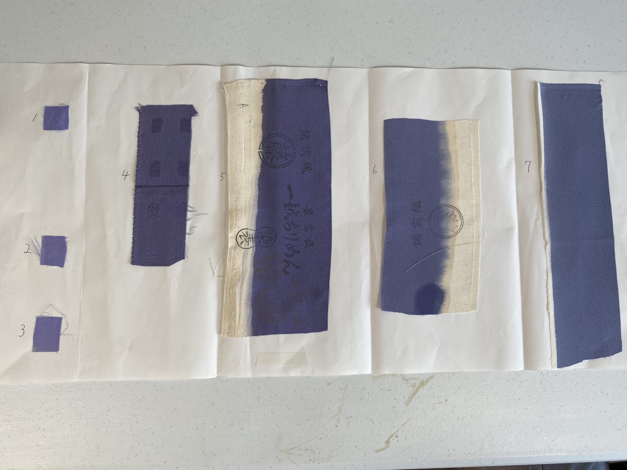
“OK, I will send you several sample fabrics via physical mail,” said Mamiya-san. Why physical mail? Why doesn’t he simply take a photo of the fabrics and send it to me electronically? I asked.
“Well, look at the photos of your kimono on the screen. The same kimono looks quite different from one photo to the other. It’s too risky to choose the color without seeing it on the real fabric,” said Mamiya-san.
By then the pandemic situation already started to affect the mail delivery schedule. We were nervous, but Mamiya-san mailed the sample to me anyway.
The color samples took exactly three weeks to reach me in Seattle, while in a normal situation it would take less than a week.
Seven pieces of cloth were glued on a sheet of white paper, with the numbers 1 through 7 written next to each piece. All the pieces looked like the leftovers from rolls of kimono fabric. Numbers 5, 6, and 7 looked to be the edge of the roll because part of them was left undyed.
These seven colors were quite different to the naked eye even though they were more or less the wisteria color. Numbers 1-3 were much brighter than 4 and 5. Numbers 6 and 7 were dull compared to #1-3. Number 1 was the most brilliant.
Once I received the sample fabrics, I chatted with Mamiya-san online. He asked about Seattle summers. How does the sky look compared to Japan’s summer sky?
“The blue is much clearer than the sky in Japan”, I replied.
Then let’s go with No. 1, he said.
“I wouldn’t recommend this color to a customer in Japan, but it would be suitable under the blue sky in Seattle,” he said.
I took a photo of the color sample with my iPhone, uploaded it on my computer, and looked at it on the screen. Where did the wide variety of shades and shines go? On my computer screen, most of them look the same! How could I possibly choose the right color?
Mamiya-san was right. I appreciated that he sent me the physical sample.
By the way, Mamiya-san mentioned that one of the colors is called “Fuji Nando藤納戸.” Fuji means wisteria, and Nando means storage room. The color that wisteria flowers would look like in a dim storage room… Such an intriguing expression to describe a color, isn’t it?
Although Mamiya-san has produced hundreds of kimono and obi during his long career as a kimono retailer, the We Love Kimono Project was a new challenge for him.
Previously, Mamiya-san either produced a kimono to match an existing obi, or a new obi to match an existing kimono. With this project, however, he would produce both a new kimono and a new obi simultaneously. Where to start? How to communicate with both the obi maker and the kimono maker? Mamiya-san had many things to explore.
I really wanted the obi to be made by Katsuyama-san. Although he was not willing to make any more summer obi due to the lack of demand, thanks to Reiko-san’s persuasive pitch, Katsuyama-san agreed to make one for me, utilizing one of Rakufulin‘s designs.
The starting point was choosing the obi design.
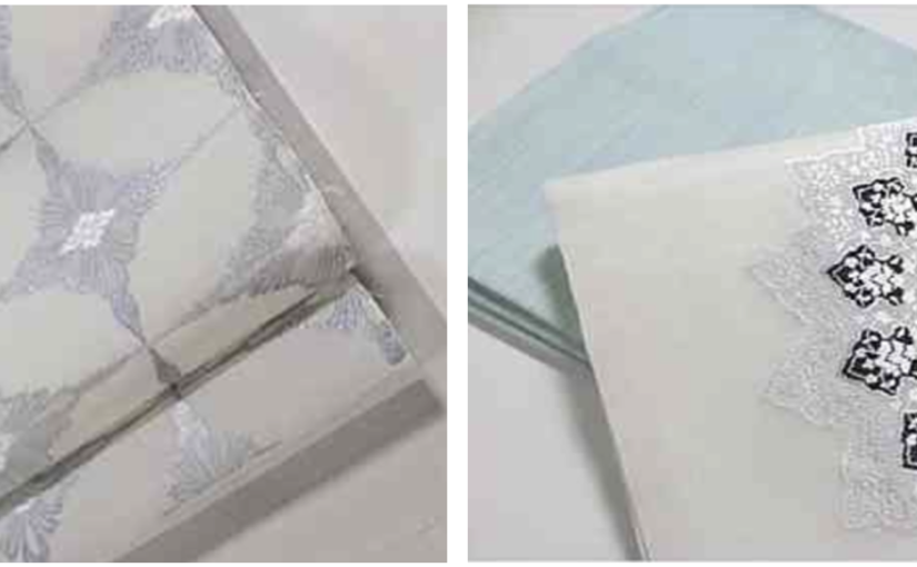
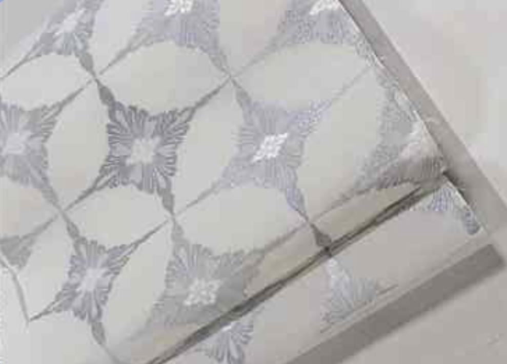
Reiko-san sent me photos of two obi designs, recommended by Katsuyama-san.
One was called Shippo七宝. Four oval shapes overlap one another. With the literal meaning “seven treasures”, the design is one of the traditional Yusoku 有職 designs, cherished by Japanese aristocrats for more than a thousand years.
The other one was called Islamic Flower, an original design of Rakufulin, created from Horie-san’s fabric collections.
I like both! How can I choose one? That’s when Mamiya-san came to rescue me.
After seeing several photos of me in a kimono, he recommended the second one. “The first one would look a little too soft on you. The second one is more impactful and better suited for you.” OK, Mamiya-san. I will follow your suggestion. One decision was made.