Tradition is alive in my mother’s blood
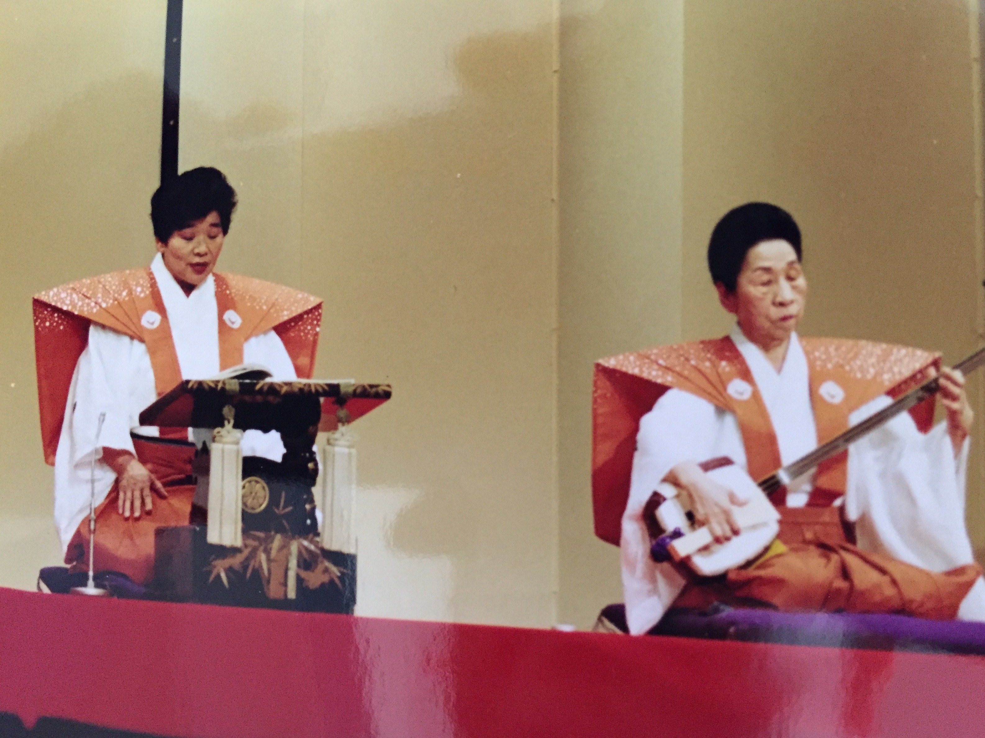
My mother reciting Gidayu – photo by Author
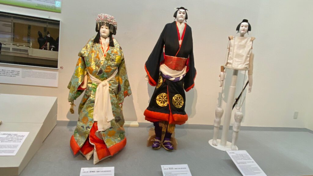
It’s called Ningyo Joruri人形浄瑠 or Bunraku 文楽. According to UNESCO’s website, it has a longer name as Ningyo Joruri Bunraku Puppet Theatre. On UNESCO’s Intangible Heritage website, it is described as “Ranking with Nô and Kabuki as one of Japan’s foremost stage arts, the Ningyo Johruri Bunraku puppet theatre is a blend of sung narrative, instrumental accompaniment and puppet drama.”
Let me call it Bunraku for short.
As the UNESCO site describes, it’s one of Japan’s stage arts, like Nô (or Noh) and Kabuki. There are many academic distinctions among the three arts. For example, Noh is different from the other two because Shamisen, a three-string musical instrument, is NOT used in Noh. Kabuki is different from Bunraku because real people act on the stage rather than puppets. During the Edo period (1603 – 1868), Noh was patronized by the ruling samurai clan. Kabuki and Bunraku, on the other hand, evolved among ordinary people, including merchants, craftspeople, and farmers.
For my mother, the distinction among the three arts is more subjective and absolute. She grew up with Bunraku, not with Noh or Kabuki.
There used to be small Bunraku stages in a small village in Tokushima Prefecture in Shikoku Island, where my mother grew up. In those days, people living in rural villages in Japan must have had very little entertainment, and Bunraku must have been a precious one. Still today my mother recalls how excited she used to be whenever she heard the powerful, low sound of Futozao (thick neck) Shamisen playing on the Bunraku stage. I don’t think my mother has ever watched Noh play. For her, Noh is as foreign as Shakespeare or Western plays. But Bunraku is in her blood.
One of her life’s highlights is the days that she took lessons of Gidayu, the reciting part of Bunraku. In Osaka, the then-living national treasure Takemoto Sumidayu 竹本住太夫 used to teach Gidayu at Asahi Culture Center. My mother must have been in her forties or early fifties. She happened to see the advertisement for the class. With no hesitation, she signed up for it.
“There were 7 or 8 people in the class. Each student had a chance to recite the part we learned from the previous lesson in front of Master Sumidayu, no more than 5 minutes. But when it came to my turn, I started reciting, and the 5-minute limit passed, but the master ignored the time limit, and let me recite the whole part. I must have been that good or at least I must have been reciting from the bottom of my heart, and the master knew how much I love Gidayu.” My mother was so proud of that moment and would often tell me the same story.
Time has passed. Master Sumidayu passed in 2018. Now my mother has complete dentures, and with the fear that her dentures would fly out from her mouth while reciting, she has quit Gidayu.
But her love for Bunraku has not waned. She often takes a train to the National Bunraku Theature in the center of Osaka and enjoys watching it.
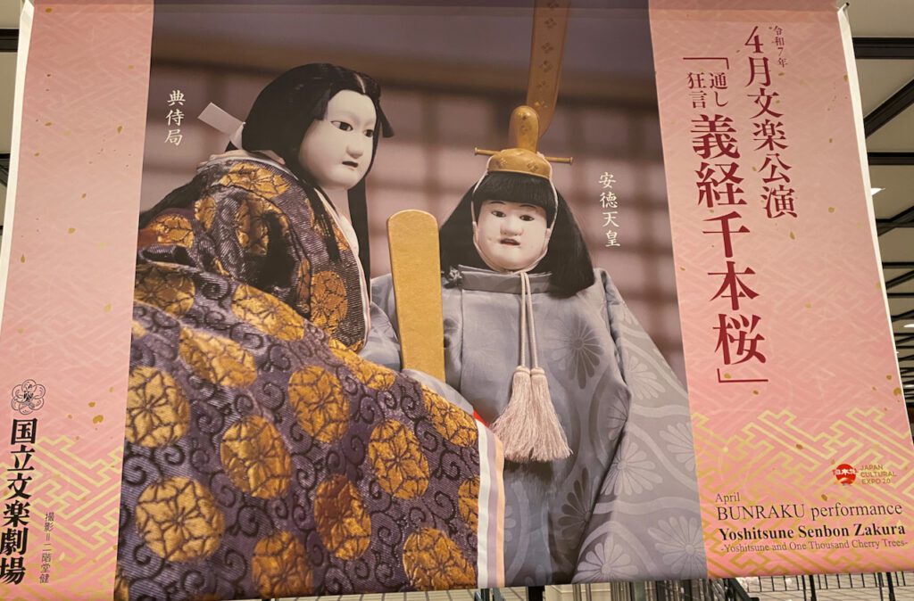
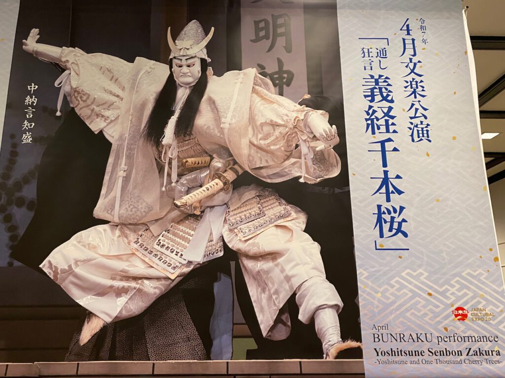
When I visited my mother this April, Yoshitsune Senbonzakura 義経千本桜 was playing at the National Bunraku Theatre. My mother and I went to see the mid-afternoon part. The theater was a little over half full. To my surprise, I saw quite a few foreign tourists. With the help of the audio guide they rented, I wondered how much of the reciting they understood. Without that equipment, maybe I understood less than those tourists, because the reciting was in old Japanese that I was not familiar with.
The reciting, however, is only half of the whole appreciation of the Bunraku play. The movement of the puppets! When the puppets express human feelings, like laughter, anger, sorrow, with exaggerated action of crying, laughing, screaming, dancing, pounding something, holding each other tightly, looking at each other intensely, eyes to eyes, by crying so hard that the head is shaking constantly… You no longer think that you are looking at the puppets but as if you were watching real humans acting. The exaggerated narration of Gidayu helps you become immersed in feeling of the character. It’s all magic.
Now I understand why my mother loves Bunraku so much. While watching, I heard my mother murmuring the Gidayu part together with the performer. She must have learned the scene from Master Sumidayu.
Several years ago my mother asked me to digitize the old cassette tapes that she had recorded during her lessons with Master Sumidayu. For a long time, I forgot all about it. It’s still on my computer! Next time I visit my mother, I will play it for her. It’s my present for her next birthday. I hope she will like it.